
Khaos Control brand guidelines
As a company we pride ourselves on our quality and consistency. In that same vein, we have designed a set of Khaos Control brand guidelines, containing our official Khaos Control logos, that should be followed when promoting Khaos Control or any of its products.
Khaos Control
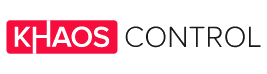
Khaos Control’s logo represents both our company and our flagship product. There are two versions of the logo – the main logo and the icon.
As a first port of call, use the main logo wherever you can, as long as it fits within the space required. For smaller spaces, the secondary logo can be used i.e. on smaller flyers. It’s preferable that the Khaos Control logo is placed on a white background where possible.
Primary Logo
Secondary Logo
Khaos Control Cloud
Representing our product, Khaos Control Cloud, are our two logos, main and secondary. These are an immediate representation of our cloud-based solution and should be used whenever referencing Khaos Control Cloud.
When using the Khaos Control Cloud logo, please place it on a white background – the green is the defining factor of Khaos Control Cloud’s branding, and needs to be presented with the focus on the colour.
Primary Logo
Secondary Logo
Khaos Control Hybrid
For Khaos Control Hybrid, our gold and black logo should be used. When talking about or referencing the solution, use the main logo where possible, and for small spaces use the secondary icon. Always place the logo on a white background to ensure the golden colour stands out.
Primary Logo
Secondary Logo
Company colours
Khaos Control
RGB: 246, 12, 61
CMYK: 0, 95, 75, 4
Hex: #F60C3D
Khaos Control Cloud
RGB: 64, 183, 127
CMYK: 72, 0, 69, 0
Hex: #40B77F
Khaos Control Hybrid
RGB: 254, 195, 93
CMYK: 0, 25, 73 ,0
Hex: #FEC35D
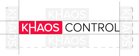
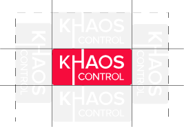
Spacing considerations
When using any of our logos, consider the below spacing requirements. Our logos shouldn’t be cramped or squished on a page and needs to have adequate space to breathe. Meeting our spacing requirements keeps our logo consistency high and the possibility for error low.
Minimum size usage
To ensure our logos are still recognisable when used by others, please don’t make them smaller than the below sizes.
Web: No smaller than 220px in length.
Print: No smaller than 50mm in length
Web: No smaller than 80px in length.
Print: No smaller than 30mm in length
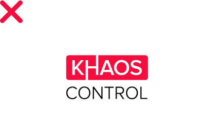
Incorrect usage
Please don’t use any of our logos, representing the company or our products, incorrectly. Incorrect usage covers using old versions of the logo or distorting it in any way. Use only the logos located in this document, if ever in doubt, contact our marketing team marketing@khaoscontrol.com.

Logo is incorrect as CONTROL is warped and is therefore out of proportion with the rest of the logo.
This version of the logo is old and discontinued.
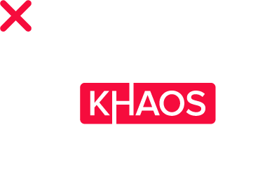
CONTROL has been completely deleted, making the logo somewhat unrecognisable and damaging to the overall brand.

Logo is incorrect as has been rotated – always keep logo horizontal.
Still unsure which logo to use for your project?
Drop our marketing team an email: marketing@khaoscontrol.com